
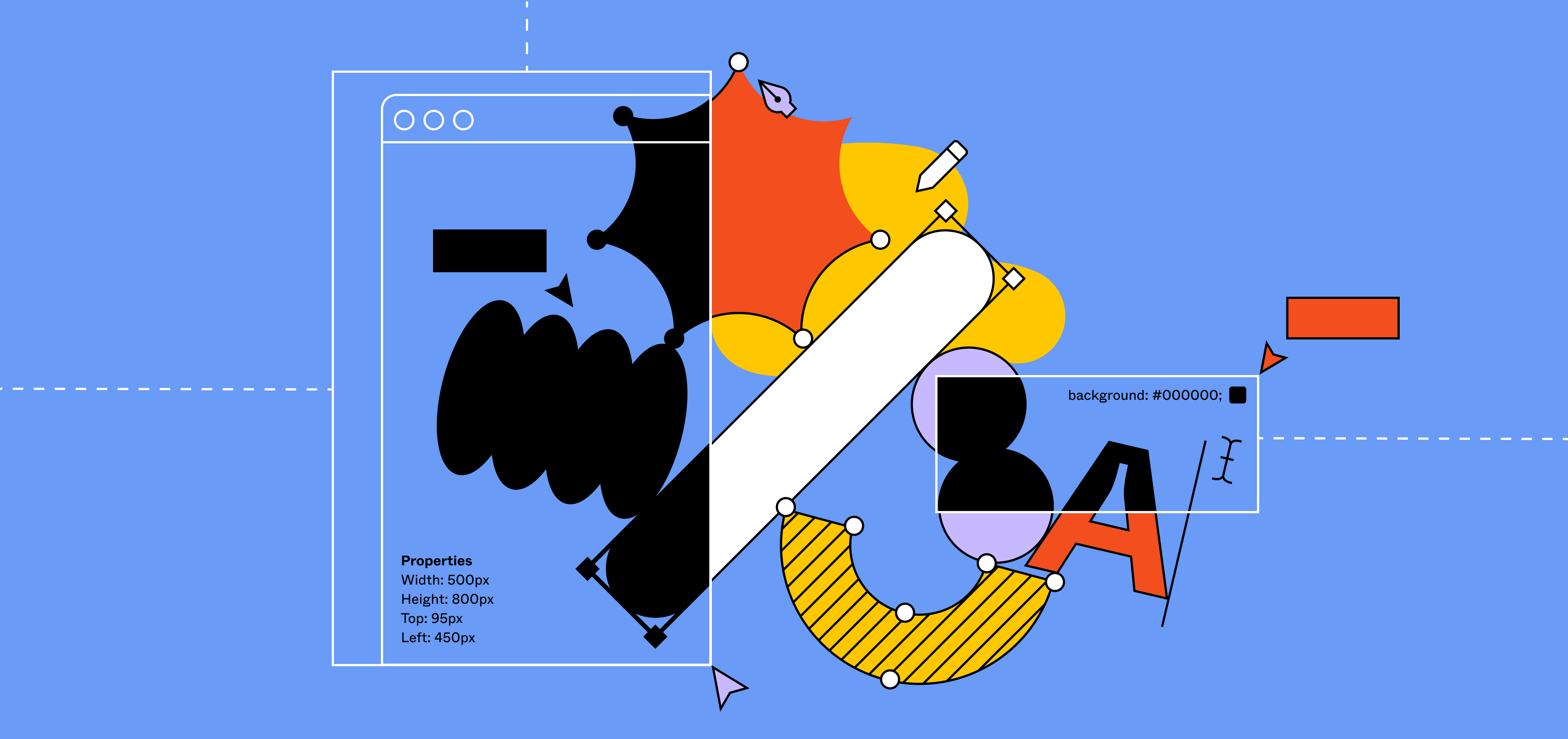
Bridging design and code with Variants


Today, we’re excited to introduce Variants, which lets you combine variations of the same component—simplifying the asset panel and mapping components more closely to code. This feature, along with changes to the Inspect panel and updates to Auto Layout, will enable designers and developers to work more efficiently together. Below, we dive into how we built Variants, including the crucial pieces of feedback our users gave us along the way.
We believe that a design tool should embrace concepts from both design and code Everything we announced at Config Europe, and how we’re bringing design and code closer together in Figma.
Embracing the tension between code and design
As we thought about how to bridge design and code in Figma, we realized the biggest opportunity was to redesign how components are treated. Not only was it difficult to find the right components and switch between related variations (bye, endless instance swap menus!), keeping your design systems organized was tedious and didn’t map to how developers think about components.
As we started to design towards this solution, we worked closely with our users to refine the experience, so it’s helpful and intuitive for a variety of use cases.
Aligning how designers and developers think
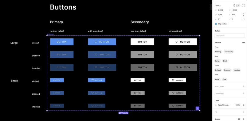
As a company grows, its design system inherently gets more complex. To manage this complexity, many design system managers adopted a “forward-slash” naming convention to organize components (e.g. default/primary/large/icon). They worked around the limits of our component feature in order to communicate various states and properties that commonly exist in code.
When designing Variants, we wanted to evolve our components feature to support multiple dimensions of variation and a key:value pair naming convention, like state=”hover” and style=”secondary.” Whether your design system consists of simple, single-dimensional components or more complex, multi-dimensional ones, your components in Figma will better mirror your components in code.
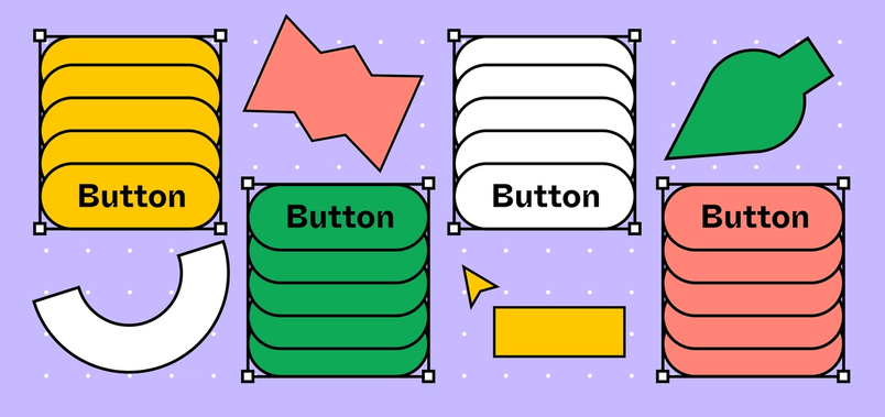
After shadowing several design system managers, we noticed that they typically laid out components in a grid in order to work on different variations of a component and compare variations to one another. As a result, we architected the new Variants feature so that all variations of a single component can be laid out side-by-side—based on how design system managers actually work in Figma.
This not only proved to be useful for design iterations and library maintenance, it also opened the door for us to build a simple path for users to start using the new Variants feature—simply select all component variations and click “Combine Variants” into one component set.
Refining the UI through usability tests
After nailing down component organization, we wanted to design a UI that was both intuitive to use and easy to consume. We built a functional prototype and ran 4 rounds of usability tests over the course of 6 weeks.
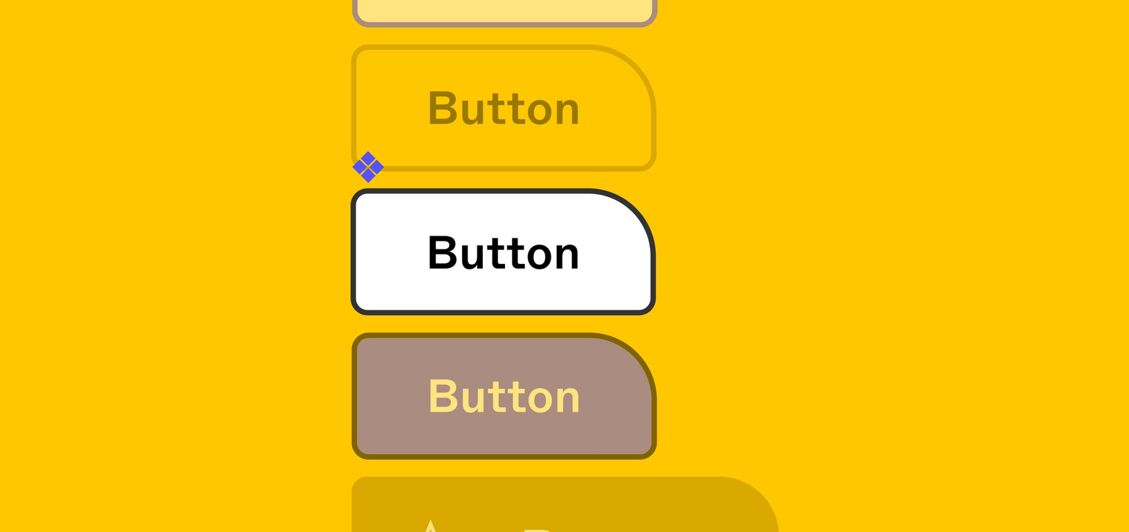
One of the harder design challenges to solve was communicating the new key:value naming construct. Our first designs showed all available property values as pills. However, we soon discovered that users struggled to understand this UI as it behaved differently than they intuitively expected.
Because pills are commonly used for tagging an object with multiple attributes, our original premise of always showing all values as pills did not work. After a few iterations, we simplified and switched to a dropdown menu design, only showing a simple input field for every property when a specific variant is selected.

However, we kept the pill design whenever users wanted to see all properties and values of an entire component set.
Another learning we discovered along the way is default naming. For example, presenting system defaults like State and Style was actually less intuitive, compared to presenting generic property values (e.g. “Property 1,” “Property 2”) which made it more clear that they should be customized to values like Type or Size.
Figuring out the right feature name
As we got closer to launching Variants, we had to embark on what is usually the most difficult part of any product development process—deciding on the feature name. At the start of this project, we called the feature “States,” as the initial use case we focused on was supporting the complexity of interactive states.
During user testing, one of our users at Fidelity Investments pointed out that the name “States” did not fully represent the full scope and possibilities of this feature. The feature didn’t just enable users to create different states of a component (e.g. hover, active, disabled), it can flex to any property type, like type, color, size, and more: “States seems to water down the power of the feature,” the Fidelity team said. “It makes you think of just button or object states.”
While we couldn’t exactly call it “super customizable component that you can do whatever you want with—feature,” we did agree that the name needed a revisit. Variants emerged as a much better way to capture the complexity the feature can support.
As we started to use “Variants” in subsequent usability tests, our users further validated that name was more intuitive and representative of the scope of the feature.
Paired with the upcoming Auto Layout updates and the new changes to Inspect panel, Variants is working to help you design and develop products more efficiently. And with the help and invaluable feedback from our amazing beta users, the new Variants feature is available today to everyone.
Check out a walkthrough of Variants in this playground file, get more tips in this help center article, or read up on best practices.
Related articles